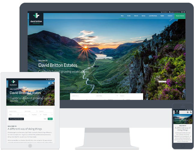
David Britton upgraded his old website and this time chose theme R10. Its a really nice example and the great photos used in the opening slideshow really gives it a wow factor. This design demonstrates how it can also cater for the more square shaped logo and therefore overhangs the top header.
-
ADDITIONAL FEATURES
Extra Pages
-
YEAR
2019
-
CLIENT
David Britton
- LIVE URL