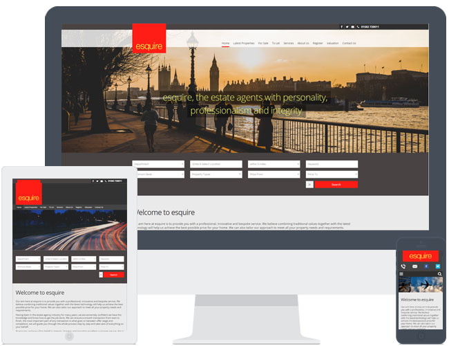
Esquire picked the new theme R7. Their strong red branding contrasts nicely against the dark grey website, really making it stand out. They have used the default banner text over their first slide, providing a simple introduction about themselves.
They also chose to have the additional blog feature implemented, to make better use of their online social presence, and have a 3rd party instant valuation tool in place.
-
YEAR
2017
-
CLIENT
Esquire
- LIVE WEBSITE